Gallery Visit: IMA Platform

In a new, ongoing project, the Institute of Modern Art commissioned three artists under 40 with a Queensland connection, who are yet to have an exhibition in a public gallery. The resulting Platform exhibition shows three very different types of work.

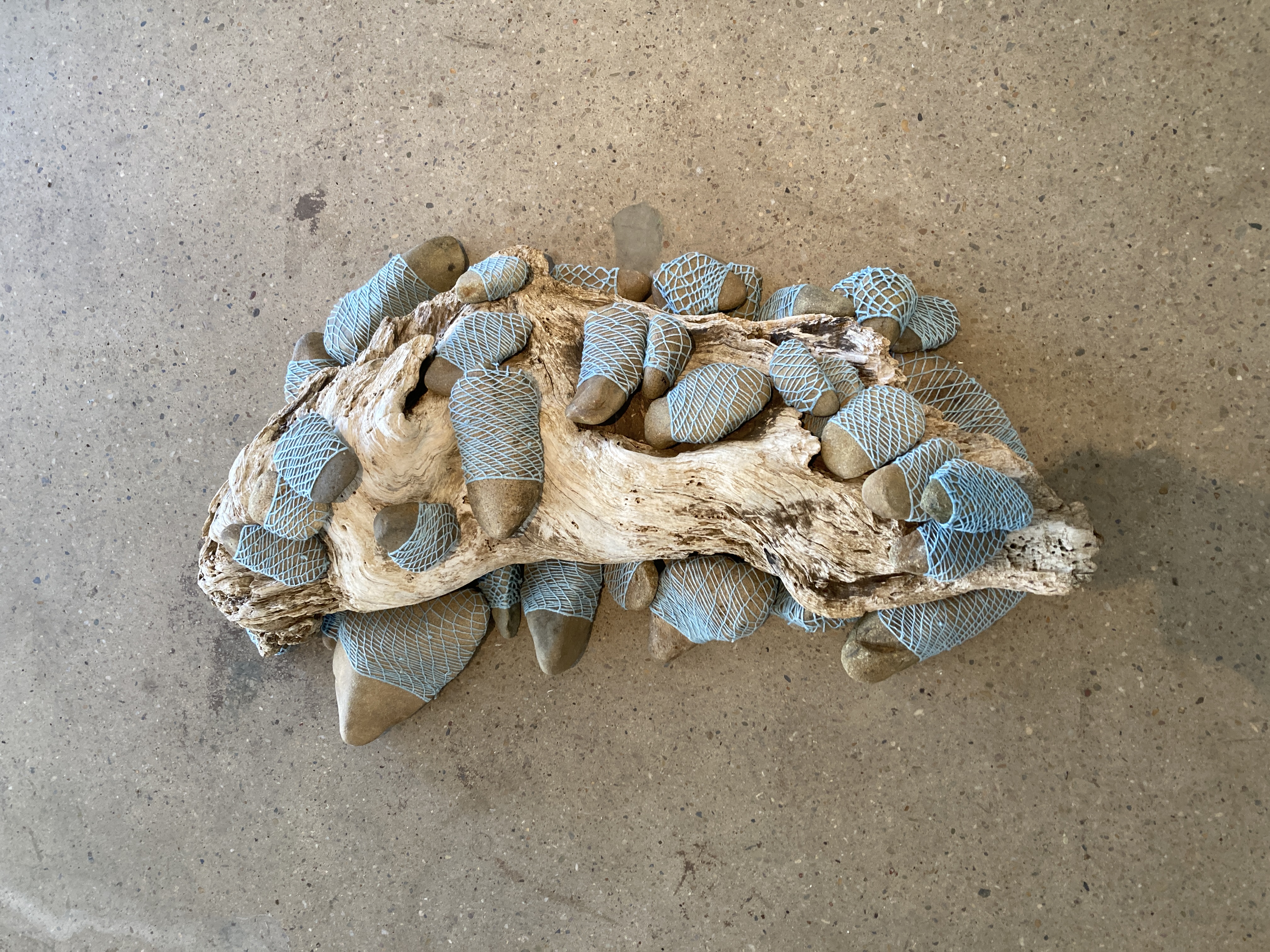
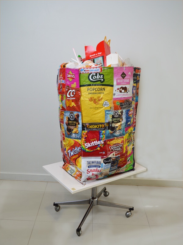
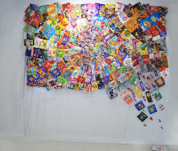
The first room the viewer enters contains Miguel Aquilizan’s sculptural works. I first saw his work in Outer Space in a joint exhibition with Jordan Azcune and Jessica Dorizac, Material Culture in a Material World in 2023, and these works appear like an evolution of strange shapes and motifs that filled Outer Space. Aquilizan uses familiar everyday objects, foraged and found, and constructs assemblages that combine these objects in new constellations.

Use of the found mirror lets the viewer reflect on their own place in the consumption and disposal cycle.

The found materiality may be held together with plaster, expanding foam, glue, screws and other fixers, and some have a solid form while others seem much more fragile and ephemeral. I like Aquilizan’s philosophy of using found materiality; as artists we too must curb our over-consumption of virgin product and make do with what can be reused and repurposed. The didactic notes that reuse and repurposing of objects is part of daily life in Fiji, from where Aquilizan hails. Is it affluenza that makes Australians treat everything as disposable?

This work fuses plastic human and animistic skeletons, seemingly in shape of da Vinci’s Vitruvian Man, but the tail evokes ideas of evolution in a post-human future

Aquilizan’s works bears witness to consumer items that can be found cast away in our capitalist consumer society, and some of the assemblages appear as thoughtful, slow meditations of this abundance and its consequences, while others seem to evidence a production process that is fast and furious. In light of the installation’s confusing mix, it irritates me a little that there is no didactic published for each of the works – I would like to take time with each work, but the busy-ness of the installation and the seeming enthrophy with which the works are arranged drag me on and on and out too quickly. Are they intended to be seen as a single work? Is is not clear to me.

The next room is a great contrast to this confusion, in that the entire room is tied together by the single artwork, Was Satellite Progressive? Mia Boe is of Butchella and Burmese descent and her work is inspired by Lionel Fogarty’s poem Connoiseur and the work questions how Western scientific and technological knowledge and methodologies overpower traditional ways of knowing, yet are “unsophisticated to our Murri imagined realistic minds.”

Six tall paintings are connected with a horizon line on the wall

Six paintings on the opposite wall to the entry are connected with something that resembles a horizon line, which trails all around the four walls. Each painting show red underground and red earth with one or more characters at the horizon, and the sky above the horizon. The colours of the sky change across the paintings from blue to ‘striped’ with darkness on top and yellow/red hues on the horizon line until the sky is dark in the sixth painting.

The colours of the outback and the figures reminded me of Drysdale’s paintings with his characteristic long-limbed figures in outback settings. Boe’s figures engage is various colonial, perhaps ‘scientific’ pursuits as night falls from left to right. At least there is reconciliation in one of the paintings. With the terribly fraught and divisive campaign of the Voice referendum still so fresh, it is good to be reminded that the fight for acknowledgement and recognition is not at all over. Uluru Statement From the Heart still generously invites Australia to walk with Indigenous peoples to a better future. We white fellas must continue to educate ourselves and suspend our steadfast belief that ours is the one true way only of living and knowing. It is not like we are doing either well in our fast paced, over-consuming and over-producing capitalist society. Perhaps it is time to slow down and listen to the land and the people who have cared for it for millennia?

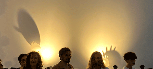
The final room is dominated by a large structure complete with floor and ceiling and open walls. It is Sarah Poulgrain’s Dreamboat. As I approach the work, I feel confused as to whether the viewer is invited to enter the structure to have a better look at the video works that play on the back wall.

The work is a response to the risk of Wreckers Artspace ARI being lost to gentrification. Wreckers Artspace is both a gallery space and a home for the artist and others. The DIY ark is built in collaboration, designed to float down Brisbane river as part gallery, part home. The structure installed at IMA is the gallery part and the video works are indeed the first installation of work in that gallery, being work by artists Alrey Batol, Charlie Hillhouse and Leen Reith.

Let us hope it does not come to a point where the Dreamboat is required, though I think it could be pretty cool to have a floating ARI on the River in Brisbane all the same.

And maybe it is this theme that binds the different works together – that the society we have constructed does not serve us well. While we are waiting for the tide to lift all boats, too many people continue to be marginalised and disadvantaged and too few people are benefiting and our planet will not be able to sustain this mode of living. A different model is required. And art has a role to play both in drawing attention to this fact, and also to point to a different vision of the world.

The exhibition continues until 16 June 2024.

Gallery visit: Norton Fredericks Contaminated at Outer Space

Forever chemicals are part of over 14,000 human-made synthetic chemicals that have been and are used extensively in consumer products. A recent research paper by University of New South Wales shows Australia as one of the hot spots for these toxic chemicals that do not break down in nature and accumulate in our bodies and in the bodies of all living beings.

So the Outer Space exhibition, Contaminated, is timely: it is an exploration of how ‘forever chemicals’ or PFAS impact art making using water and botanicals from identified contaminated sites.

Fredericks is a Queensland-based textile artist whom I first met at a Sustainability Week arts market event in Government House at QUT a few years ago. I liked that they called themselves Retritus to reflect their practice of re-using dead particulate organic matter and repurposed fabrics in art making. The practice reflects their concern for sustainability and environmental care. For these works, they collected water, soil and plant samples from identified PFAS contaminated sites in South East Queensland and Northern New South Wales to explore how these would impact the materiality of their art, including fabrics, bronze, and paper.

The result is hauntingly beautiful. Cyanotypes mix with bronze plaques stitched onto fabric, dyed fabrics hanging from the tall ceiling and rocks woven with recycled dyed yarn set upon a piece of driftwood on the gallery floor. This work was updated with additional woven rocks as a result of a public program. I like that. A work that grows in community with the viewers in the gallery space.

The viewer is reminded that our human existence is not separate from nature – humans are nature and deeply dependent on it. In the Capitalocene we are in fact interdependent on it because our activities are increasingly impacting the health of nature (including humans) in real and substantial ways. The climate emergency we find ourselves in is clearly self-inflicted, in spite what climate denying Australians might think. With PFAS and other pollutants of human activity, we are literally soiling out nest. Is that not a sign of barbarianism, rather than of civilisation?

The exhibition text is beautifully written by Dean Ansell, drawing attention to the colonial – and I would add capitalist – structures that are poisoning the air that we breathe, the earth that we walk on and the water of this one Blue Planet. Of course it is all the more awful for the original people of the countries we now call Australia to watch this extraction and destruction of the lands their ancestors have long cared for and that are so integral to their culture and being.

The artist told me that it was only in one work that the potent chemicals made a substantial difference to the look of the work. This is no comfort though. An invisible enemy is possibly worse than one you can see.

Frederick’s work is both timely and essential. That his show is at Outer Space has a fatalistic connotation: where will we go once we have made Earth uninhabitable for humans (and more than human creatures)? As the environmentalist catch cry reminds us: There is no Planet B

This exhibition continues until 11 May 2024.

Gallery visit: Clandestine Origins by Beth Crase, 23 March 2024

Installed at the Queensland College of Art and Design’s Project Gallery, this exhibition had two parts, two kinds of photographic work. Entering the left room, an explosion of abstract colours gleam from the walls in a series called Disposable Beauty. The works explore Newton’s refracted light experiment through clear plastic. A plexiglass cube sits on the window sill. It is filled with clear plastic waste from, for example, food packaging, demonstrating how cross-polarised light shone through the cube will create magnificent colours. Crase has photographed these effects, creating beautiful mountainous landscapes of colour, truly representing plastic rubbish in a new light.

The invitation to examine my values as a viewer of these beautiful explosions of colour raised two issues for me:

1. In the Capitalocene (Jason W Moore) the overproduction of plastic as single use packaging and products is foisted upon consumers through the cheap available polymer made as a by-product of the production process to make fossil fuels. And multinational petro-chemical corporations are responsible for this (see for example Mindaroo’s Plastic Waste Index 2023) and as consumers it is extraordinarily hard to avoid products without too much plastic.

2. Nothing is disposable, even if we kid ourselves to think that throwing something away is responsibly ‘disposing’ of it. It is not – the disposed object is merely somewhere else, and in the case of plastics it is in that other place for a long, long time.

Making plastic beautiful, as Crase has achieved, does not redeem this overproduction. We can in no way justify the overproduction of plastics, driven by an industry that is hell bent on securing the continuing burning of fossil fuels for profit reasons. Yet we do not to ingest it when it enters waterways and our food systems and we do not need our fresh fruit and vegetables to be wrapped in the stuff. Perhaps this is exactly what Crase wanted us to see.

In the right-hand room of the Project Gallery hangs another series of photographs, but these are made in a process that entirely bypasses the camera. The Flush series provides intriguing black and white images of water and aquatic forms. Crase explained how she placed recycled waste water in plexiglass trays on top of the photopaper in the darkroom, capturing movement of the water. The process is interesting and the result is surprising.

Simply looking at these works will not reveal what it is, but as the exhibition text notes, the titles remind us that the water shown here has ‘passed through the kidneys and digestive tract of thousands of individuals’.

The exhibition essay frames the exhibition with Piero Manzoni’s infamous shit in cans, Merda d’Artista (1961). I am quite familiar with Manzoni’s work, having grown up in Herning, Denmark where in 1960 and 1961 he spent time at the local textile factory making some of his most memorable pieces. Though the rather conservative regional community were outraged by the highly conceptual art created, the owner, Aage Damgaard, was both excited and inspired. And this makes Manzoni’s Magisk Sokkel (1961) and Socle du Mondo (1961) even more delicious to experience. And his artist shit cans, of course.

Artist’s Merde is an apt reference to what Crase is doing – making invisible our human waste by turning it into art – Manzoni by canning it, Crase by enlarging it into abstract and beautiful forms.

For me, reflecting on these juxtapositions, how we as humans have succumbed to modernity so completely that we have become entirely alienated from our dependence on nature and the consequences of our mode of living. And how financial interests soothe us with techno-optimism, promising to solve our soiling of our nest, including climate change, contrary to all reasonable evidence. Can art move us into imagining a different way? A New Quotidian, even?

My son as art on Magisk Sokkel No. 2 (1961). Herning Kunstmuseum, 2000.

Gallery visit: Ian Burns Whose Body What Mind, What Body Whose Mind, The Renshaws

The kinetic sculptures of Ian Burns examine imagery in a digital enabled world, and recently developed works can be experienced at The Renshaws in Brisbane until 21 June 2024.

Entering the main gallery, the eye is drawn to the movement of a fan blowing air onto digital screens (From the Other Side (2024). The screens show a picture of a woman on the right and a man on the left, both with long blondish hair in a pose reminiscent of a portrait. Emulating a virtual reality experience, as the fan moves from one screen to another it seemingly makes the subject’s hair blow in the wind, in a trompe l’oeil illusion. The work creates a sense of real and digital integration, not far from what is experienced when we don virtual reality glasses.

To the right of this work sits How It Started (2024) which is a tall mechanical structure with an aquarium-like box of plexiglass in front of an image of the sky with white fluffy clouds. In a digitally driven mechanical process, two fingers (bathroom directional signs recovered by the artist) mounted on timber arms will from time to time move toward each other and emit an electrical charge between each other. The work evokes memory of Michelangelo’s The Creation of Adam in the Sixtine Chapel, the biblical creation story referenced in the title. Yet the human – and god – is replaced by digitally controlled machines. Is our current state of development, of infatuation with digital technology, robbing us of what makes us human?

Further around stands an unnamed work – a pair of large gumboots standing on a timber box with smoke belching from their shafts. The observant viewer will notice increased rumbling precedes the emergence of smoke rings from the gum boots. The world we stand on is on fire and mocking us by blowing smoke rings.

The last work in the main gallery, Winged Victory (2024) consists of two blown up rubber gloves being airlifted by two rows of small fans on a shelf. Light that increases and decreases in strength illuminates the rubber gloves and creates a bizarre show of shadow puppetry on the wall. The fans are cleverly located and managed thus that the gloves never leave the shelf and move outside the power of the wind created by the fans.In the shadows cast on the wall, the fat fingers of the gloves stand out from the bloated hand and look like hairs on a bloated face or the crest of a Nick Park penguin disguising itself as a chicken. Plastic or latex gloves became ubiquitous personal protective equipment during the covid-19 pandemic – our collection of materiality from found objects includes a multitude of gloves collected from our local environment during that period. Perhaps the work refers to the commercial victory of PPE, seen in the ready blowing around of detritus like gloves in the environment?

In the small front room we meet Cadence (2023) using lightbulbs and magnifying glasses mounted on a timber structure that moves its elements to create on the wall a moving picture of light that resembles a stick figure walking or dancing. An old-style television set shows Proven Authority Redux – Shallow (2007-24) a long term project of identifying all of Harrison Ford’s lines in movies and gradually adding the text to the screen and his voice to the audio. The video is currently 1 minute long.

As assisted readymades that combine consumer products and digital technology with mechanical movement, the works questions consumption in our digital world. The works are whimsical and fun, drawing the viewer in closer to examine how movement is created, waiting for the next burst of animated activity driven by digital technology. The visit made me think about how digital technology, and especially the internet of things, is changing our world and even what it means to be human in our world. The masses of wire to make the kinetic sculptures work tell a story of complexity that may already have exceded human capacity to manage.

Ian Burns (b. 1964, Newcastle, Australia) completed a doctorate from Queensland College of Art in 2008. He lives in New York.

Funking it up

When we announced our first post-Covid trip to Europe, we were invited to a wedding. My younger brother’s wedding. A garden party on a — hopefully — sunny summer afternoon in July. Dress code: what you are comfortable in.

I have had a thing lately with sixties and seventies designs. I love the large flowing sleeves, the bright colours and bold patterns. We recently watched the suite of James Bond movies, right from the beginning, and the aesthetic of those early 60s movies is just perfect (even if the sexism and racism is appalling!) Even better, we rewatched Mike Myers’ Austin Powers movies. Supercharging that 60s aesthetic, there was ample inspiration. I thought a go-go look might be fun.

After a little while rummaging in my own and my neighbour’s archive of patterns, a stash of patterns came into the local second hand shop. For 50c I became the owner of 7095 Simplicity. It was the right look, with a lovely collar and options for sleeve or sleeveless.

Once I looked more closely, I realised it was a maternity dress — the drawn women on the packet looked so slender and far from pregnant! The dress was designed with an extendable front, with ability to easily alter for three different sizes. What a great idea in a world where we throw so much fashion away: a maternity dress that can easily be taken out to be worn at all stages of pregnancy. Nevertheless, I would have to redesign the shape; after all, I am way beyond even the possibility of pregnancy.

In my first go at redesign, I simply cut away the extendable front of the dress, thinking even pregnant women start slender. I dug out a red cotton sheet I had found in a second hand shop and made a prototype in this fabric.

It was soon apparent that I had underestimated my own measures and shape, or rather overestimated, and the dress was way too large and a little bit too sack like. So I took it in and added a waist.

To be a go-go dress, the shape needed augmenting with a funky pattern. After researching 60s mod patterns, I settled on two potential shapes that I tested on linen cut-offs first and then on t-shirts. I hope you agree with the pattern that won in funk.

I took a trip to The Fabric Store to find suitable fabric. I usually love sewing with the Vintage Look Linen. However, that fabric usually comes in earthy colours; I wanted scarlet red. And of course The Fabric Store held a heavy shirt twill, 100% cotton in post box red, which was just right.

After cutting fabric pieces and zig zagging the edges, I started the long job of printing each pattern piece, imagining how it would fit on the finished garment. Each circular pattern took three prints, one on top of the other, so took quite a while, and quite some effort to resist printing multiple circles using the same colour — which always goes wrong for me. One print at the time is best. When coverage was poor, I used a paintbrush to cover it up. This gives a textured look, a more home-made look, but I don’t actually mind it.

Moment of truth was putting it all together, adding a zipper and voila my funky dress was finished. But something was still missing.

On one of our walks I had found a long red chiffon scarf. I washed it and printed bright red, yellow and orange flowers on it. This would serve as a headscarf. From a costume shop I ordered a pair of white pvc go-go boots, which completed the look.

With the beautiful, also very funky, bride and daughter

Is it any wonder my cousin instantly dubbed me Ms Moneypenny, even without any 007 prompting?

Consumer culture’s abundant materiality

I recently tried something different with my sewing machine, and I think the result is quite evocative, even if the narrative makes me hopping mad!

As part of our New Quotidian arts practice, we walk every day in our local area and document or pick up what has been left behind by others. We use found objects for art projects, either digitally or IRL. It is a slow practice and we never know exactly how something found might become handy one day.

Last year we started picking up soft plastic snack food and lolly wrappers, and instead of sending them to the REDcycle soft plastic recycling program, Mick photographed them, cut them out in Photoshop and we then animated them in a new video: Plastic Ocean.

New Quotidian Collective: Plastic Ocean (2022) Digital colour video, silent, made with Open Source DaVinci software, 2m 19s

We continued to collect from the catchment of Kedron Brook, thus preventing the soft plastic from being washed to the sea. An idea started forming in my head: what if the materiality of this consumer detritus could be treated as a type of textile?

I started sewing them together, using broad zig-zag stitching on my little Elna sewing machine, using white cotton I had inherited from my mother-in-law. Some were torn, and instead of discarding them I repaired their tears, again with zig-zag stitches.

Work in progress

The result was a surprisingly stable fabric-like piece. I shaped this piece into a large new wrapper, which could then emulate the sum of the parts and be filled with something. That something turned out to be rubbish from the local fast food outlet, abundantly left behind by consumers and found on our daily walk over about one month.

New Quotidian Collective: disRuptEDcycle (2022), Found objects, 85x50x55cm (Variable)

Just as I had finished this work, the soft plastic recycling scheme, REDcycle, was discovered a sham, with billions of bits of soft plastic found stockpiled rather than recycled. Consumers had taken up the return of soft plastic to the retailers with gusto, yet the promise of recycling it had fallen through. There was no demand for the recycled plastic product, especially when petro-chemical multinationals continue to flood the market with virgin polymers (Mindaroo Foundation Plastic Waste Makers Index 2021).

The work illustrated the ultimate shallowness of this virtue signalling marketing initiative by producers and retailers, who rather than reduce the overproduction of soft plastics sought to soothe environment conscious consumers with their REDcycle scam of pretence of circular economy.

So we kept collecting over the next few months, and once we had enough materiality, I started sewing this massive wall piece, Uncircular (2023). I wanted to create a sense of a vortex, of circularity going nowhere. I was still sewing on my very small sewing machine, now a bit more stiff and in need of service. As I added to the circular motion from small centre pieces to larger and larger outer pieces, it got harder and harder to manoeuvre the work. I found myself moving the sewing machine rather than the piece.

New Quotidian Colletive: Uncircular (2023), Found Objects, 135x225cm

My neighbour had given me some left-over material for making net curtains. It was a polymer product and quite revolting to work with (and how long would it actually last if exposed to UV?). But it served well as a background for the piece, a reference to nets required to fish plastics out of the ocean, and I could affix loose wrappers to it.

This gave a sense of wrappers being hurled into the vortex of soft plastic recycling. It may calm our sensibilities as environmentally conscious consumers to think we can recycle the waste we generate. Reality is that if we all lived like we do in Australia, we would use up the Earth’s biological resources by 23 March.

Though nature is abundant, consumer culture is stretching its limits for being viable for human habitation. Global climate justice demands that we in the west/global north reduce over-production and consumption of petro-chemical products, if we are to stem global warming and avoid plastic in the environment and our food chains. Though our art seeks to point to the impact of the excesses of our imperial mode of living with humour, it is intended that viewers should feel uncomfortable. Because our role as individuals in this circus is uncomfortable.

These works were part of our exhibition: Our Work Is Still Rubbish in February 2023. You can check out more from the exhibition on our website.

Sulphur-crested cockatoo peasant blouse

When we lived in Bunya during the millennium drought, we fed the beautiful white cockatoos on the deck. Until they woke us up at the crack of dawn one summer morning: a flock of over 20 cockatoos screeching, carrying on and biting every little lamp off the xmas fairy lights we had hung the day before.

When less of a good thing really is more. Photo: Mick, 2009.

In Mitchelton, the ubiquitous Australian cockatoos are still around, but they tend to fly over, screeching, rather than land in our wilderness garden. They prefer open woodlands like that surrounding our place on Mailmans Track in Bunya. In spite of their noisy and rather destructive habits, I love the cheeky large white birds and wish they would visit.

Photo: Mick 2004.

When my friend, Nonie, suggested I should try my hand at screen printing a black cockatoo, I was inspired. The yellow-tailed black cockatoo is more elusive than its white cousin, but still hang around in the she-oaks down by Kedron Brook. However, I realised I only had crappy photos and even crappier ones of the threatened glossy red black cockatoo from a show at Australia Zoo. But thanks to the friendly white cockatoos we fed in Bunya, I had stacks of great photos of them.

Moonlight grevilla was the inspiration for the flower. Lone:

So I worked up three birds, a grevilla leaf and flower for screen printing.

Planning three colour screen print of the birds. In essence I need to create negatives and the black of the stencil is really important because it is what blocks out the uv that exposes the emulsion. Photo: Lone 2022.

My bucket of emulsion had been sitting in the fridge for near on 18 months, with recommended lifetime after mixed about 9 months. Unperturbed I set to cover 80T screens, and expose them with my drawings.

Some failed, especially the very fine detail, and the times I put the emulsion on too thickly and the exposure failed to wash out or washed out the supposedly exposed emulsion.

In the end I had a patchwork of workable imagery across six screens that I could put together complete birds.

I create screens from timber frames bought cheaply in op shops or found during kerbside collection. You’d be surprised how many there are! Photo: Lone 2022.

I found a sewing pattern in Mitchelton Library’s generous collection of Love Sewing magazines (thank you, awesome librarians!)

McCall’s M8256. Photo: Lone 2022.

I had an umber-coloured piece of the now phased-out Vintage Finish Linen from the Fabric Store. I cut the pattern pieces and zig zagged to prevent fraying. I then printed a pattern of sorts, with yellow grevilla flowers and dark green grevilla leaf, and using white, yellow and a mixed grey for the birds.

Photo: Lone 2022.

I then assembled the relatively easy blouse, my only challenge being entirely self-made: I forgot to set the machine to long stitches when basting the neckline and had a really hard time unpicking the narrow stitches of contrast coloured cotton.

Check and double check before cutting and before sewing are relatively simple rules I in my eagerness often dismiss. So I must live with the consequences! Photo: Lone 2022.

I love the result. The sleeves are airy and flowing and the gathered neckline resembles what in Danish is called a ‘bondebluse’ (does it translate to ‘peasant blouse’? I am not sure).

The cool linen fabric makes this a perfect summer top for the Queensland heat.

From punch needle tufting to rya

Earlier this year, I saw Natalya Hughes’ The Interior exhibition at Brisbane’s Institute of Modern Art. Hughes’ work explores the construction of women in psychoanalysis (hysteric?), through reimagining the consulting room of Sigmund Freud.

Artist talk with Natalya Hughes and curator Tulleah Pearce in The Interior exhibition at IMA. Phone: Lone 2022.

I was intrigued by the exhibition and its surrealist treatment of the artefacts in Freud’s room, 3D printed obscure versions of Freud’s antiquities and bizarrely shaped couches in which viewers were invited to sit.

Natalya Hughes worked with Max Athans to reimagine Freud’s antiquities as 3D printed objects with enlarged female features. Photo: Lone 2022.

What really took my fancy were the tufted rugs. They were bright in colours, featured bizarre shapes and images and beautifully executed as deep soft rugs.

Hughes told me that when she was invited to work with IMA to develop the exhibition, she did not know how to tuft a rug, but that it could definitely be learnt. So maybe I could learn it too! Unfortunately, I was too late to secure a ticket for the needle punch tufting workshop with Hughes.

Tufted rug by Natalya Hughes. Photo: Lone 2022

Necessity is the mother of invention. As I researched tufted rugs, I realised they are probably not a genuine part of my cultural heritage, more associated with the ancient Persian cultures.

Then something in this research made me recall that in grade four – in a class called handicrafts – we learnt the Scandinavian practice of shaggy rug making – also known as rya. Pinned to the wall in my childhood home, was a large rya rug in brown and orange colours, right out of the 1970s, and I thought I should give it a go.

On Youtube I found a creative with an instructional video which did not involve a loom. Very helpful for my frugal creativity!

In grade 4, I remember the backing as corse, scratchy hemp stramaj, with large woven holes to aid looping – I think this style of holed fabric is called aida in English. I could not find anything useful that resembled the stramaj I remembered. So I cut a square piece of white linen tablecloth that I had found in the secondhand store. I had a enough leftover from the rather failed attempt at creating a pair of fitted linen pants from it, at least to try out rya technique.

Because it was much finer than any aida fabric, I drew red lines on the fabric so I could create the shaggy loops in fairly straight lines. I realised that the thinner the rules the denser the shagginess would be. I drew no particular pattern or image, thinking this was too advanced for this early attempt.

I had a bunch of cotton yarn that I had bought for knitting dish cloths, in colours I fancied to have a go with. I recalled using wool rather than cotton, but I thought cotton would create a softer result than scratchy wool. I found an old wooden ruler and a large headed needle and off I went. Loop after loop, changing colours along the way to create streams of colour with organic jagged edges.

It was a long and painstaking process that I undertook during the evening as we watch various SBS series (and particularly difficult to follow when I needed to read subtitles). Yet, in the end it was done.

In the second hand shop I found a pillow I thought would fit within the final cushion cover. To complete the cushion cover, I used some cut off legs from a pair of Dickies pants, which seemed just the right quality for backing.

I created a line of buttons in the centre and stitched the cushion cover together. I have to confess that I made a mistake – the buttons were meant to be visible on the outside, not hidden! But I could not bear unstitching the thing again once I realised.

As I created the backing it turned out my square was not quite square and was on the small side for the cushion. I had to unstitch some of the stitches that went too close to the edge. Fitting the pillow in was a bit of a battle, but the result is ok and fun, I think.

Thank you to Natalya Hughes and your art for making me recall a traditional craft from my homelands and my childhood.

Foxy flares

The red fox is endemic to the northern hemisphere and ubiquitous in Europe and my mother country, Denmark. In Australia, they are considered the most damaging of invasive spieces and about 7.2 million of the carnivorous four-legged animals roam the country. Red foxes were introduced to Australia in the 1830s for the purpose of fox hunting. The appetite for a ‘nobleman’s’ sport in ‘the new world’ was not only barbarous and inhumane to the foxes, it continues devastate native Australian wildlife and ecosystems today, like so many features of colonisation.

Foxy found object – a baby toy. Photo: Lone

If red foxes do not belong in our environment, they do look pretty cute as a stylised design. For some reason foxes feature frequently in Australian toys, as these two found objects attest.

Foxy found object – a toy bag. Photo: Lone

I was pretty happy with my op shop find of a double doona cover with a pattern of rows of orange foxes with black noses. Closer examination confirmed it was 100% cotton with no polyester. At a price of $2.50 there was nothing to lose.

At home I discovered that the right side was adorned with a pattern of larger foxes identical to the little ones. That’s for a future project, yet to be determined, so it has gone into the growing fabric stash. The current project called for some flares and flow.

The Mitchelton Library has a wonderful and expanding collection of the UK Love Sewing magazine and in one of these I found a pattern I thought suitable for the fabric: McCall’s M8167. Photo: Lone

I traced the right sized pattern onto tissue to create my own pattern pieces – after all, the original belongs to the people of Brisbane. I transferred the pattern to the doona cover. The pattern was directional and I wanted the foxes to run horizontally across the dress, so I had to ignore some of the grain direction instructions. To my peril, perhaps.

Using the old Elna serger I inherited from my mother-in-law, I secured the fragile edges of the cut pieces, and then I set to sewing.

As promised on the pattern (facile), this was not too hard. I added pockets with contrast colours to the sides.

Pockets were not in the pattern. So I just copied some from a different pattern and attached them at an appropriate height. Photo: Lone.

The flared sleeves are just as funky as I expected, though the direction of the foxes were necessarily messed up.

Lovely flared sleeves. Photo: Lone.

The V neckline was surprisingly difficult for a rookie like me. My fabric bulged and was too much. My neighbour, Birgitte, and partner in sewing crimes alerted me to the brilliance of the zig zag scissor (pinking shear to those familiar) to cut light fabrics in circumstances like these, and I happened to also have inherited one of these. And this did help some, but not all of the awkwardness in the turn of the V.

All that fabric in the bottom of the V. No amount of ironing will remove this flaw. Photo: Lone.

Though I am happy with the end result, I am not sure if I don’t look like a demented woman in a nightie when I wear it. What do you think?

Foxes by the fish pond. Stay away from the frogs and the chicken!

Froggy deconstruction

You know when you have a favourite piece of clothing, which is comfortable and makes you feel good, and so you wear it until it falls apart? I had such a summer dress, bought for $20 at Eumundi Markets in July 2016. It was a blue-come-turquise cotton with a repeatable golden print, and had a flattering fitted cut to show off my waist, made in India (possibly by an underpaid and undervalued seamstress) and sold under the label Inspired. Best of all: the dress had pockets that fitted the mobile phone perfectly. I especially enjoyed wearing it for walks on the beach, and also at art galleries in London.

Selfie in my Eumundi dress in Christopher Baker “Selfie Seer” in Saatchi Gallery “From Selfie to Self Expression” 2017. It may be a smile, or slight concern in the eyes of my cousin Anja.

After 8 years of wear, it is probably no surprise it was faded, worn out and torn in various places, in spite of my handy and ongoing mending. It was time to rethink my favourite dress in time for summer 2022. But the Inspired label was nowhere to be found. It was not likely I would be able to find this dress in any shop, on or off-line.

So I deconstructed it.

Taking photos of detail, I carefully analysed its construction. I had never done a consealed zipper before, but undeterred I unstitched it.

Bit by bit I took it apart, unstitching the stitches and labelling each bit of fabric as I went, and making note of the sweing techniques applied.

I used the deconstructed dress pieces to develop the shapes for a pattern. Some would call it stealing, but like Superflex I subscribe to the mantra: If value, then copy. And if any reader knows who owns the intellectual property from the Inspired label, please let me know so I can acknowledge and seek permission, post copy, of course.

The window of Danish Art Collective Superflex on Blågårdsgade, Nørrebro, Copenhagen, 2015.

At an opshop, I bought a second hand sheet for $2, which I cut according to the pattern pieces to test how I would put together the pieces and to test its fit. A key problem turned out to be the pockets, taking me some goes at figuring out how to construct them so the right side of the fabric ended up in the right places.

Meticulously I documented each step so I could figure out how to complete the dress on more valuable fabric. I wanted to print my newly designed frogs on a length of sand coloured Vintage Finish Linen from The Fabric Store.

I made a few changes to the design of the dress. The original dress had three panels making up both the front and the back boddice. I decided to cut the back in one piece, which lent itself better to the handprinting and removed an unnessesary complication.

The original dress used piping to finish seams. Though this made a nice structure for the repeatable pattern, I decided against this for my printed fabcric. Perhaps I had trouble figuring out how to do it too.

Armed with the dress pattern and learnings of the sheet fabric dress, I set to cut and print the fabric. I decorated the cut fabric pieces with my newly designed set of frogs in a relatively random pattern to fit the look I was after.

For the interfacing I printed some leftover contrast-coloured teal Vintage Finish Linen, using a less successful full colour frog screen.

I more or less successfully created some Hong Kong seams for the shoulders, adding to the structure of the shoulder straps.

In spite of my careful documentation of process, I had endless trouble with the pockets. Perhaps this was because an unpatterned fabric is somewhat forgiving with right and wrong sides. I also had issues with the concealed zipper. Thankfully Kenneth D King from Threads Sewing explains it well on Youtube for all to see.

In the end I had probably given myself a bit too much seam allowance, for the finished dress seems to be for a fuller figure, in spite of the test piece fitting quite well. Or maybe I lost some weight…

My completed, deconstructed and reassembled frog dress at the fish pond where the frogs have recently deposited a clutch of eggs in the reeds, in celebration of spring.